The CPG giant refreshed its corporate logo to attract strong talent and keep employees engaged.
Consumer packaged goods brand Colgate-Palmolive needed to refresh its corporate logo and identity, which hadn’t been touched since the 1980s, said Kevin Bender, Director, Digital and Design, Communications, at Colgate-Palmolive.
The logo is the manufacturer’s mark on the back of all of its packaging, while the primary product’s brand, such as Colgate, Speed Stick or Irish Spring, is on the front. In that sense, the target audience for the rebrand was Colgate-Palmolive’s 34,000 global corporate employees in the short term, and future employees and the investor community in the long term.
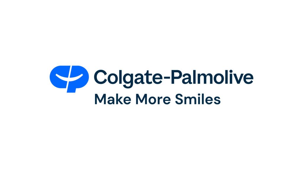
After 2.5 years of work, Colgate-Palmolive unveiled the refreshed design and tagline “Make More Smiles” to employees in August. The new logo is a more vibrant blue, lower capitalization and more adaptable to digital channels than the previous one. Instead of a horizontal white line, the line now arcs into a smile.

Employees Thumbs Up the New Logo
“There was such excitement and joy expressed by our employee population on LinkedIn,” Bender said. “We’re talking hundreds if not over a thousand comments; One of our most engaged social posts of the year and 500,000 impressions across social platforms.”
The sentiment was overwhelming positive with only 2% negative comments. In a survey of corporate leaders and 298 North American employees, 98.6% of respondents agreed that the new brandmark made them proud to work at the company.
Plus, 99.3% of respondents agreed that the Make More Smiles tagline effectively supported the brand’s purpose. Previously, the company did not have a tagline.
These are good results, Bender said and will help employees be more engaged and help the brand attract strong talent over time.
“Immediately we have the results of employee sentiment and pride, and we know that happy, engaged employees are more productive,” Bender said. “The goal of having a more engaged workforce is a step in the right direction.”
How Colgate-Palmolive Developed the new Logo
Three senior leaders and the corporate communications leadership spearheaded the redesign. It also hired creative agencies Design Bridge to help design the logo and Bindery to assist with the tagline. The team interviewed 40 global employees to gather insights and buy-in from employees.
Bender would not disclose the investment in the initiative, only that Colgate-Palmolive was efficient with its budget and made it go “incredibly far.”
The new logo will gradually appear on packaging over time. Bender doubts consumers will notice, but that’s OK as it was not the goal.
“We had done our homework in terms of how we went about this process of interviewing employees from around the world and gathering feedback about what really makes the Colgate-Palmolive Company special, so that the identity that we presented to employees actually reflected the company that they live and breathe every day,” he said. “And that ultimately the identity feels true to employees.”