Ever wonder how that bear-shaped honey bottle was created? Or that tear-shaped soy sauce bottle? How about the Tiffany & Co. box in that iconic shade of blue?
The packaging wrapped around a product can make or break sales. In many cases, while shopping, we don’t even realize we’re seeking out a familar shaped package or color to draw our eye to the product we’re looking for among the dozens and dozens of similar products.
This article looks into how eight of the most iconic product packaging lining store shelves came to be. It’s an absorbing look back at the stories behind the packaging that we all take for granted—in addition to honey bear, Soy Sauce and Tiffany—Morton Salt, heart-shaped boxes of chocolate, Campbell Soup cans and Toblerone. Packaging is a multi-billion dollar business. Just the growth in beverage packaging markets is projected at a compound annual growth rate of 4.4%, to hit $131.1 billion by 2019, according to analysis by MarketsandMarkets.
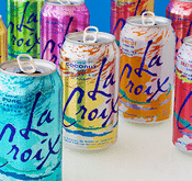
And in an lesson for marketers, the team at National Beverage did not like—at all—the colorful, abstract neon design presented for cans of La Croix seltzer waters, but consumers did sending product sales skyward. Read the article …
Related articles:
Coke’s New Packaging Strategy, Sameness
Oreo Lets People Customize Packaging to Bolster E-Commerce
In a Nod to Millennials, Head & Shoulders Bottles Made from Beach Plastic