8 Reasons Why Responsive Web Design Cannot Be Ignored
By James Warren
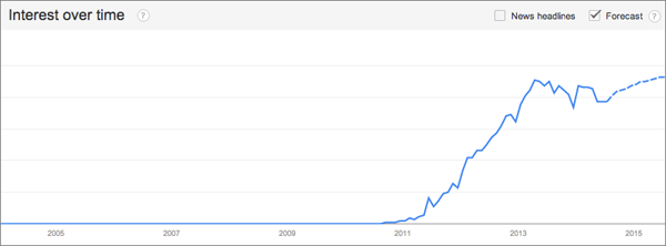
Chances are your competitors have already implemented responsive web design (RWD) while your customers are stuck pinching and zooming your site on their smartphones. According to Google Trends, interest in RWD spiked in 2013 and flattened a bit this year, but now continues to grow at a steady pace.
 In the current fragmented environment of innumerable tablets and mobile devices, RWD is a practical, well-tested solution to address your customers’ mobile appetite while protecting your online investments. Here are eight reasons why responsive design cannot be ignored.
1. Mobile web usage is not slowing down.
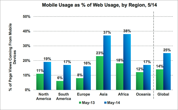
In fact, it’s being adopted by more people, and at a faster rate, every year. In May 2014, 25% of global web page views came from mobile devices―an increase of nearly 79% from May 2013.
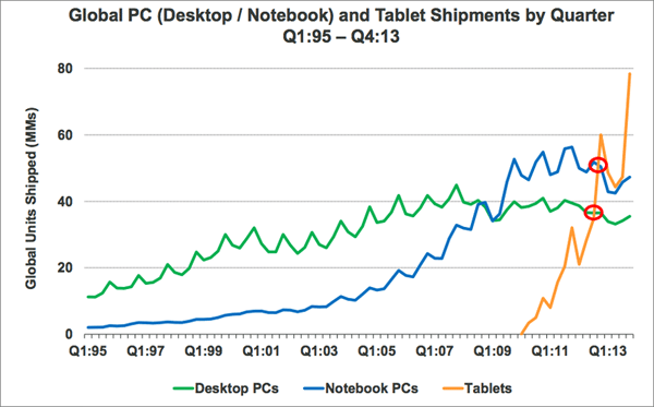
 Plus, according to Pew Research Centers, “at least 58% of Americans have a smartphone and 42% have a tablet”[3]—and tablet ownership is growing faster than desktop or notebook PCs ever did. Mobile sites are reaching an ever-growing number of customers.
 2. Customers are tackling more tasks on mobile.
Tasks that would have been inconceivable to complete on a phone just a few years ago are now routinely performed. Digital banking is now preferred to offline banking for its convenience and flexibility. According to eMarketer, “44% of US Internet users ages 18 to 34 used online banking to pay monthly bills, make deposits, and withdraw money from a mobile device. [These customers are] turning to digital banking to make their lives easier, as 76% said that online and mobile banking are more convenient”.[4]
Another example is customers’ willingness to complete applications on mobile devices. Recently, Discover Financial updated their online credit card application to be entirely optimized for mobile visitors—including a way for applicants to take a photo of any required documentation and simply add it to the application. Across the market more and more complex processes are being optimized for mobile.
3. Customers want a consistent experience across devices.
People expect customer experience to be consistent, regardless of the device they are using. According to a recent SDL survey “58 percent of millennials polled said they expect to engage with a company whenever they choose and via whichever channel they elect”.[v] RWD seamlessly addresses this need as a technique in which the same code for a site is delivered to every device with the presentation adjusting automatically to the fit device’s screen size and capabilities.
As Ian Magnani, partner at digital customer experience agency, Magnani Caruso Dutton, explained, “A responsive website allows a company to provide a consistent experience to their customers regardless of the device, whether they choose to interact through their smartphone at home, or their desktop at work.”
The consumer electronics company Samsung does an exceptional job connecting their online experience across devices. Using RWD Samsung.com “responds” and appears differently depending on the device and its screen size. The website combines smart ecommerce, user-centric design, and a powerful brand experience so customers can seamlessly learn, shop, and own across desktop, mobile, and tablet. When the site launched, Samsung found customers more likely to complete orders and to purchase more items per order.
4. The mobile web is frictionless.
RWD allows your site to have a single URL across all devices. When your customers share your website on social networks, their followers can go directly to your website regardless of their device. This is important since social networks are often accessed on mobile devices. According to the Adobe 2013 Mobile Consumer Survey, accessing social media is the number one mobile activity today[6].
Add to this fact that nearly two-thirds of email opens take place on mobile devices[7] makes having a RWD site experience just a click away more important than ever.
5. Responsive design improves SEO.
Search engines rank websites that are optimized for mobile searches higher because they have a single URL. Google recommends RWD for this very reason since it enables its “algorithms to assign the indexing properties to your content” and for it to “discover your content more efficiently”[8]. Search engine optimization is complex so take advantage of RWD’s impact on it.
6. Responsive development is easier.
With each passing quarter your site gets more mobile traffic, and with that comes the arrival of numerous devices and operating systems. Do you have the time and cost to create and maintain native apps for all of them? Core to RWD is that a single codebase for a website serves both mobile and desktop users. Development becomes easier because this removes the maintenance nightmare of multiple code versions targeted at different device types.
Keep in mind that a single codebase implies the mobile version of the website on smartphones has the same size as the desktop version. Poorly coded responsive websites tend to be slow to load on mobile devices, which can create an unpleasant customer experience and cause poor conversion.
However, coded properly, responsive sites can perform just as well as native apps. You’ll need to keep in mind: design enhancements at multiple breakpoints, testing across device types, defining and maintaining media queries, and adaptively delivering assets and optimizing media; yet this pales in comparison with maintaining consistent functional releases across multiple native apps (and a website).
7. Customers reward well designed mobile sites with loyalty.
A well-designed responsive site is imperative to be competitive. Customers are more engaged and likely to return to responsive sites. According to Google Mobile Ads Blog, “61% of customers stated that if they had an unfriendly mobile experience they would quickly move to another site”[9].
RadioShack.com streamlined for mobile, adding a touch-optimized store locator with click-to-call and GPS functionality. When RadioShack tallied the results, they found the average order value for mobile customers was 30% higher, while cost per conversion on mobile decreased 5%.[10]
8. Future-proof your site.
Responsive web design goes beyond mobile. By using RWD with structured content, your site will stand up better to the coming onslaught of smart TVs, in-car systems, wearable devices, digital signage, and any number of unimagined presentation genres.
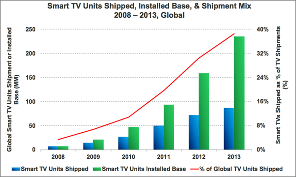
For example, Smart TV usage may still be in the nascent stage but is growing rapidly. eMarketer estimates that more than 113 million people—35.5% of the US population and 45.0% of internet users—will use a connected TV regularly this year, and in 2015, the majority of US internet users will access the internet through such a device[11]. The connected TV audience will post double-digit growth rates through 2017.
 James Warren is the Digital Intelligence and QA Director at Magnani Caruso Dutton. He can be reached at [email protected].
[i] “Google Trends – Responsive Design Interest.” Google Trends. N.p., n.d. Web. 21 July 2014.
[2] Meeker, Mary. “2014 Internet Trends-Code Conference.” KPCB. Kleiner Perkins Caufield Byers (KPCB), 28 May 2014. Web. 19 July 2014.
[3] “Mobile Technology Fact Sheet.” Pew Research Centers Internet American Life Project. N.p., n.d. Web. 20 July 2014.
[4] “Millennials Invest More Time in Digital Banking.” eMarketer. N.p., 24 Mar. 2014. Web. 21 July 2014.
[5] The Wall Street Journal. “SDL Study Reveals Channels Are Irrelevant to Consumers.” The Wall Street Journal. Dow Jones & Company, 14 July 2014. Web. 21 July 2014.
[6] Pun, Ray. “Adobe 2013 Mobile Consumer Survey: 71% of People Use Mobile to Access Social Media.” Digital Marketing Blog. Adobe, 25 July 2013. Web. 21 July 2014.
[7] Burdge, Brooke. “New Research Shows Mobile Dominates Desktops with 65% of Total Email Opens in Q4 2013.” Movable Ink Blog. N.p., 22 Jan. 2014. Web. 23 July 2014.
[8] “Recommendations for Building Smartphone-Optimized Websites.” Official Google Webmaster Central Blog. Google, 6 June 2012. Web. 21 July 2014.
[9] “Google Mobile Ads Blog.” Google Mobile Ads Blog. Google, n.d. Web. 21 July 2014.
[10] “RadioShack Converts 40% to 60% of Mobile Store—Locator Clicks into Store Visits.” Think with Google. Google, n.d. Web. 21 July 2014.
[11] “Majority of US Internet Users to Use a Connected TV by 2015.” eMarketer. N.p., 13 June 2014. Web. 21 July 2014.
RELATED ARTICLES:
12 Tips for Better Responsive Design


